Playfair and the “Flatten the Curve” Graphic
One of the good early tidbits from Edward Tufte’s “The Visual Display of Quantitative Information” is this quote from Scottish political economist William Playfair’s 1786 book “The Commercial and Political Atlas”:
Information, that is imperfectly acquired, is generally as imperfectly retained; and a man who has carefully investigated a printed table, finds, when done, that he has only a very faint and partial idea of what he has read; and that like a figure imprinted on sand, is soon totally erased and defaced.
This speaks to the general principle, widely accepted now but less so at that time, that tables of data can be hard to interpret and understand, and that knowledge gained from them is fleeting. Deep truths revealed by diligent statistical analysis are of limited value if they can’t make themselves readily understood, and if they don’t stick in the minds of viewers.
One of the great recent triumphs of visual design was the justly-famous “Flatten the Curve” graphic that illustrated the need to keep the rates of COVID-19 transmission low enough that hospitals could keep up and not be overwhelmed. It actually originated from the CDC in a 2007 publication with a title only a career bureaucrat could love: “Interim Pre-Pandemic Planning Guidance : Community Strategy for Pandemic Influenza Mitigation in the United States : Early, Targeted, Layered Use of Nonpharmaceutical Interventions” (Centers for Disease Control and Prevention (U.S.) 2007):
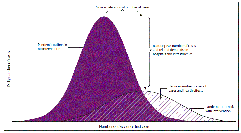
Ponderous as the document’s title may be, this graphic nonetheless showed this nontrivial concept very well. The solid-colored curve was the bad scenario of an outbreak of a pandemic with no intervention, and the transparent curve was a view of squishing that outbreak down over time so that it would be more manageable.
As brilliant as the design was - far, far more effective than paragraphs of explanatory text with supporting tables of data - it was still a bit text-heavy, with two text axes and five chunks of (small) inline text that had to be read to fully understand its meaning, and similarly-colored curves showing the two different outcomes, so it wasn’t quite a glance-level chart that could be instantly understood. When COVID-19 hit in 2019, this graphic was popularized and went through many iterations of further simplification, to make its message as clear and impactful as possible. The New York Times published this version in 2020 (Roberts 2020):
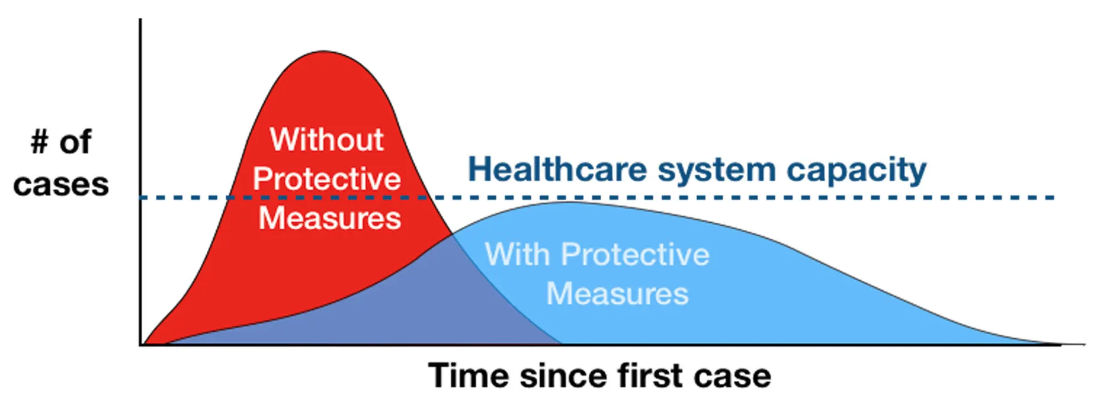
This is even more effective: the text and colors are bold and easy to read, the axis text is simplified, there are only three elements of text in the graph (each only three words), and a third item has been added: a horizontal line indicating the healthcare system’s capacity. This is about as simple and direct as it’s possible to make this information. It communicated a complex problem in a way that could be instantly understood, by almost anyone, regardless of education levels. It may have saved millions of lives, by being shared around the world and absorbed into the collective human understanding of what needed to happen to make the pandemic as manageable as possible.
(Another very subtle and effective change was the rendering of both curves as slightly irregular in shape, as opposed to the mathematically perfect normal-distribution forms in the CDC’s original graphic; this would help to reinforce the notion that infection / hospitalization / death rates from the pandemic would not follow shapes that could be precisely predicted, though overall trends could still be forecast.)
Not every complex social phenomenon can be rendered into such an effective message, but good data science should always strive for this level of simplicity and clarity when the purpose is to communicate something important as broadly and effectively as possible.
References
Reuse
Citation
@online{linberg2022,
  author = {Steve Linberg},
  title = {Playfair and the “{Flatten} the {Curve}” {Graphic}},
  date = {2022-02-19},
  url = {https://slinberg.net/posts/2022-02-19-playfair-and-the-flatten-the-curve-graphic},
  langid = {en}
}